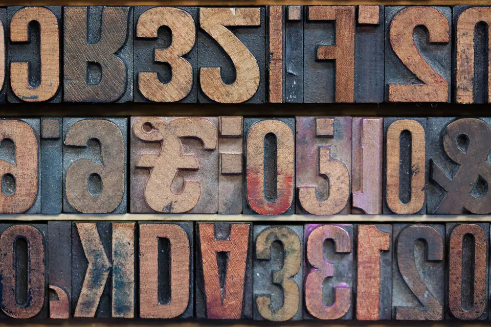
The choice of font is an important part of a logo design. The use of the right type of font can strengthen your logo and your brand while the use of the wrong font is an open invitation to customer rejection.

(Pixabay / stux)
Choosing the perfect font is a daunting task, considering that there are thousands of fonts available. The following tips can help you choose the best font for your logo:
- Avoid the ordinary, but don’t go too crazy – You don’t want your brand to be forgotten with a mundane font that everyone else is using. Try out different fonts available through various websites. In your effort to select a unique font, don’t go too crazy. Keep it fresh and simple, and don’t use too many different types of fonts. Stick with one—or possibly two. Too many fonts can create a logo that is cluttered and busy.
- Watch the competition – Find out what font types your competitors are using. If you see a pattern to the same style of fonts across many similar brands, there’s probably a reason for the consistency and you can try going down the same path. However, you do not want to look like you are copying. If people think that your logo is a knockoff, they may think the same thing about your products.
- Be timeless – There are styles and fonts for every era. Fonts that may be considered attractive today may be obsolete by next year. Look for a font that is not only current but one that will stand the test of time.
- Leave some space – Do not use fonts that are cramped and crowded. People will have to strain to read them. On the other hand, don’t space your letters out too far apart either. This could make your logo look disjointed.
Logos are critical. They give a first impression of your company and help promote your brand’s identity. Make sure that your logo is supported by appropriate and attractive font choices.