by Damon Burton @ Utah Sites | Sep 9, 2025
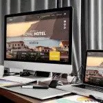
Millions of customers start shopping on their phones, only to abandon their purchases halfway through. Why? Because sites are hard to navigate, load times are slow, buttons are unresponsive, or checkout forms seem designed for a decades-old desktop computer.
Don’t be that business that loses customers because your eCommerce website doesn’t work properly on mobile devices. When potential customers can’t easily browse and buy from their phones, they’ll simply find a competitor who makes mobile shopping effortless.
So how do you create a truly captivating mobile experience? It starts with understanding what works on the small screen. Below, our e-commerce web design agency professionals will walk you through the essential elements that turn mobile visitors into paying customers.

(freepik/Freepik)
Touch-Friendly Navigation
Mobile users navigate with their thumbs, which completely changes how they interact with your e-commerce site. Effective mobile navigation means sizing buttons for fingertips, placing key elements within comfortable thumb reach, and providing clear visual feedback when users tap.
The technical requirements are more precise than most businesses realize. Buttons need minimum 44-pixel touch targets to prevent mis-taps. Navigation menus must collapse logically without burying important categories. Search bars require prominent placement since mobile users often prefer searching over browsing through multiple menu levels.
Navigation elements also need to account for different grip patterns and device sizes. What works on a compact phone becomes awkward on larger screens held with two hands. Color contrast ratios, button spacing, and gesture recognition all factor into whether your navigation feels natural or frustrating.
Optimized Product Images
Most small business owners upload the same photos they use for their desktop site and wonder why mobile sales are disappointing. The truth is, mobile users shop with their eyes first, and if your product images don’t grab attention instantly, they’re scrolling past your products to find something that does.
To make sure your images work on mobile, you need photos that load quickly while still looking sharp enough for customers to see important details. Your photo galleries also need to be responsive to touch. An experienced WordPress web design company can set up image optimization that delivers high-quality images on mobile screens while keeping file sizes small enough for instant loading.
Accelerated Mobile Performance
Slow speeds kill conversion rates on mobile.
Research shows that 53% of mobile users abandon sites that take longer than three seconds to load.1 Yet most e-commerce sites are loaded with high-resolution images, multiple tracking scripts, and bloated code that turns mobile shopping into a waiting game.
High-performing mobile sites optimize everything to make sure pages load instantly.
They compress images to reduce file sizes without losing visual quality, minify code to remove unnecessary bulk, and implement third-party tools like payment processors to avoid creating performance bottlenecks.
Streamlined Checkout Process
Your mobile checkout process can make or break your sales. Even if customers love your products and your site loads perfectly, a complicated checkout will send them straight to your competitors.
The problem is that most checkout processes feel like they were built for people sitting at desks with full keyboards. Users too often have to click through multiple pages, fill out endless form fields, and create accounts before they can buy anything. There’s too much friction between “I want this” and “purchase complete.”
The best mobile experiences combat this by streamlining the process to require minimal typing and tapping. From guest checkout options to mobile payment integration like Apple Pay, they eliminate the frustrating form-filling that makes mobile customers abandon their carts.
Smart Search and Filters
When customers are shopping on their phones, they don’t have the patience to click through multiple category pages. If your mobile search is slow or doesn’t understand what customers are actually searching for, you’re losing sales.
Mobile users expect autocomplete suggestions that help them find products without typing everything out. That means your search needs to predict what they’re looking for after just a few letters, suggest relevant products instantly, and understand variations in how people describe the same item.
Additionally, it needs to include filters that allow customers to narrow down results quickly. When a user types “blue dress,” they should be able to refine their search by size, price range, and style without starting over.
Mobile Security and Trust Elements
Mobile shoppers are more security-conscious than desktop users when entering payment information. If your security badges are tiny, buried at the bottom of pages, or don’t display properly on phone screens, customers won’t feel safe completing their purchases on your mobile site.
When implementing trust elements on mobile, make sure to place them prominently near checkout buttons and payment forms. Additionally, make your customer service contact information clickable so mobile users can call or email you directly from their phones if they need immediate assistance.
Design Mobile First to Win More Customers
These are some of the elements that go into creating a stellar mobile browsing experience. When optimizing your e-commerce site, make sure to integrate them into your overall mobile strategy if you haven’t already.
If you’re new to mobile optimization or feeling overwhelmed by the technical complexity, an experienced e-commerce design agency can help you implement these elements correctly.
Mobile commerce continues dominating online shopping, and businesses with superior mobile experiences consistently outperform competitors who treat mobile as an afterthought.
1https://support.google.com/adsense/answer/7450973?hl=en
by Damon Burton @ Utah Sites | Aug 21, 2025
When you need a website for your business, finding the right designer can make or break your online success. Many business owners rush into hiring decisions and end up with websites that look good but fail to attract customers or generate leads.
Local businesses have the advantage of working with a local web designer who understands the market and can meet face-to-face when needed. However, proximity alone does not guarantee a good outcome. You still need to avoid the common mistakes that lead to disappointing results and wasted money.
(freepik/Freepik)
Not Defining Your Website Goals
Before you contact any designer, you need to know exactly what you want your website to accomplish. Let’s say you have a coaching business in Ogden. Are you trying to get people to sign up for your ongoing webinars? Subscribe to your newsletter? Or book an initial consultation? Without clear goals like these, even the most talented local web designer Ogden has to offer cannot create a strategy that delivers results for your business.
When you approach designers without defined objectives, you end up with websites that look professional but fail to convert visitors into customers. You might get a beautiful homepage with no clear calls-to-action, or an impressive design that does not work well on mobile devices where most of your customers browse.
Take time before your first consultation to identify your primary business goal. When you can clearly communicate this objective, designers can recommend the right features and functionality to support your success.
Focusing Only on Aesthetics
It’s easy to get excited about how your site will look, and design certainly plays a major role in creating a positive first impression. But if you focus solely on colors, fonts, or layout without considering how your website functions, you could miss the mark.
Web design includes much more than just visuals. It covers usability, mobile responsiveness, and loading speed. A beautiful site that takes too long to load or confuses users will lose potential customers quickly.
Ask your designer about their approach to mobile optimization and user experience. These behind-the-scenes elements are just as important as visual appeal when it comes to actually converting visitors into customers for your business.
Not Asking About Past Work
One of the easiest ways to understand a designer’s capabilities is to review their portfolio. This gives you insight into their style, versatility, and ability to handle different types of projects. But don’t stop there. Ask about the goals of each project and whether those goals were achieved.
In addition to reviewing samples, ask for client references. Talking to past clients can help you get a sense of how the designer communicates, handles feedback, and manages deadlines.
For example, if you’re looking for a collaborative process, you’ll want someone who welcomes feedback and maintains regular check-ins. If you prefer a more hands-off approach, you’ll need a designer who can run with minimal input and still deliver a great website.
Not Clarifying Communication Preferences
Many web design projects fail because business owners and designers never establish how they will communicate throughout the process. You assume the designer will update you regularly, while they assume you will reach out when you have questions or concerns.
This lack of clarity leads to frustration on both sides. You wonder why you have not heard anything in weeks, while your designer thinks everything is going smoothly. By the time problems surface, deadlines have been missed and budgets have been blown.
Before starting any custom web design project, discuss exactly how and when you will communicate. Will you have weekly check-ins? What happens if you need to make changes? Clear communication expectations prevent most project disasters before they happen.
Ignoring Maintenance and Post-Launch Support
Many Utah businesses think their website work ends once the site goes live. However, websites need regular updates, security patches, and content changes to keep working properly and stay secure from hackers.
Many designers only build the website and then move on to other projects. They expect you to handle all future updates yourself or hire someone else for maintenance. If you assume ongoing support is included without asking, you could be left scrambling when problems occur.
Before hiring a designer, ask specifically about post-launch support. Do they offer maintenance plans? Will they train you to make basic updates? What happens if something breaks six months later? Getting clear answers prevents frustrating situations down the road.
Choosing Based on Price Alone
Budget is always a consideration, but if you choose a designer solely because they offer the lowest quote, you might end up paying more in the long run. Lower costs sometimes reflect a limited scope, less experience, or less time devoted to each client.
That doesn’t mean you have to go with the most expensive option, either. Instead, look for value. What are you getting for your investment? Will the designer help with strategy, content planning, SEO, or performance optimization? Do they offer training or support after launch?
Sometimes, a mid-range investment with a designer who offers a strategic, full-service approach will deliver better results than a basic template at a bargain rate. Remember, your website is a business tool. Investing wisely now can pay off with higher traffic, better conversions, and fewer headaches in the future.
Set Yourself Up for a Successful Partnership
The key to getting a website that actually helps your business grow is choosing the right designer and managing the project well from start to finish. When you define clear goals, focus on functionality alongside design, establish good communication, and plan for ongoing support, your project has a much better chance of success.
Take time to research potential designers thoroughly and ask detailed questions during consultations. Look for someone who understands your business goals and can explain how they will help you achieve them through your website design and strategy.
By avoiding these common hiring mistakes and choosing a designer who prioritizes results over just appearance, you invest in a digital asset that pays dividends for years to come.
Infographic
Many business owners make avoidable mistakes when hiring a web designer, which result in sites that look appealing but fail to meet their objectives. This infographic reveals seven mistakes to avoid when selecting a web designer.

by Damon Burton @ Utah Sites | Aug 5, 2025
When a potential customer searches for your services and clicks on your website, those first few seconds determine everything. If your site takes too long to load, they will leave and find a competitor before they even see what you offer. Page speed directly impacts whether visitors become paying customers.
(freepik/Freepik)
Why Speed Matters More for Local Businesses
Local businesses face unique challenges when it comes to website performance. When customers search for services in their area, they often compare multiple options quickly. A slow-loading site means they will move to the next local competitor before your page even finishes loading. You lose the chance to make your case.
Mobile users make up the majority of local searches, and they expect instant results while on the go. Someone looking for a nearby restaurant, contractor, or service provider will not wait for a sluggish mobile site to load. They need information fast and will choose businesses that deliver it.
Local search rankings also depend heavily on user experience signals. When visitors quickly leave your slow site to find faster alternatives, search engines notice. This hurts your visibility in local search results, making it even harder for potential customers to find you in the first place.
Common Speed Problems Local Businesses Face
Local businesses often create websites with performance issues they never see coming. These problems usually develop over time as content gets added and plugins accumulate, slowly degrading the user experience without anyone noticing until customers start complaining.
Here’s what often leads to the problem:
Oversized Images Slowing Everything Down
Many business owners upload high-resolution photos straight from their camera without optimizing them first. A single uncompressed image can be several megabytes, making pages crawl to a stop. Professional photographers and product shots look great but kill loading times when not properly sized.
Too Many Plugins and Add-Ons
WordPress sites are especially vulnerable to plugin bloat. Each additional feature adds code that has to load, and some plugins conflict with each other or contain poorly written code. What starts as a simple business website becomes a slow, clunky mess.
Cheap Hosting That Cannot Handle Traffic
Budget hosting plans often oversell server resources, meaning your site shares limited bandwidth with hundreds of other websites. When traffic spikes or other sites get busy, your loading times suffer.
The Cost of Ignoring Website Performance
Frustrated visitors are only the beginning. When you ignore speed problems, you face much bigger consequences that directly impact your business success.
- Lost customers choose competitors instead—Local searchers compare multiple options quickly, and slow sites get eliminated first before potential customers even see your services or pricing.
- Search engines push you down in rankings—Google’s algorithm favors fast sites, so poor performance hurts your visibility when people search for local businesses like yours.
- Mobile users abandon your site immediately—With most local searches happening on phones, a slow mobile experience means losing the majority of your potential customer base.
- Your marketing dollars get wasted—Paid ads, social media posts, and other marketing efforts drive traffic to a site that converts poorly because of speed issues.
- Reputation damage spreads through reviews—Customers mention poor website experiences in online reviews, warning other potential customers away from your business.
Why Speed Optimization Requires Professional Expertise
Building a fast website sounds simple, but it requires technical expertise most business owners do not have. Figuring out why your site is slow and how to fix it involves understanding server configurations, image compression, code optimization, and dozens of other factors that affect loading times.
Many business owners try DIY solutions or hire cheap freelancers, only to end up with sites that still load slowly or break entirely. That is why it is better to work with companies specializing in Utah or Salt Lake City site design. They have the experience and tools to diagnose speed issues and build sites that perform well from the start.
When you work with experienced designers, you get a website built for both speed and conversions. They handle the technical complexity while ensuring your site looks professional and represents your business well.
How to Choose the Right Design Partner
Not all web design companies prioritize speed optimization, so you need to ask the right questions before hiring. Look for firms that can show you examples of fast-loading sites they have built and explain their optimization process in simple terms.
The best Utah web design companies will test your current site speed during the consultation and point out specific problems they can fix. They should also discuss ongoing maintenance because speed optimization requires regular attention as your site grows.
Ask potential partners about their experience with local businesses and request references from past clients. A good web design firm understands how local customers behave online and builds sites that convert visitors into customers.
Taking Action on Your Website Speed
Speed problems only get worse with time, so addressing them quickly protects your business from losing more customers.
Working with an experienced web design business ensures you get lasting solutions rather than quick fixes that break later. Professional designers can rebuild your site with speed in mind or optimize your existing platform depending on your needs and budget.
The investment in proper web design pays for itself through better search rankings, higher conversion rates, and improved customer satisfaction. When local customers can find and use your website easily, your business thrives.
by Damon Burton @ Utah Sites | Jul 24, 2025
As any web design agency will tell you, designing a business-to-business website is fundamentally different from designing a consumer-facing site. Business buyers have longer decision processes, involve multiple people, and need more detailed information before they’re ready to move forward.
Strategic B2B web design means structuring your site around how business buyers research and evaluate potential partners. Your layout, navigation, and content hierarchy should guide visitors through your sales process naturally while presenting the depth of information they need to feel confident about contacting you.
In this guide, you’ll find actionable design advice for creating a high-performing B2B website. Follow these strategies to structure and organize your site in a way that builds credibility with business buyers.
(freepik/Freepik)
Get to Know Your Audience
To create a successful B2B website, you need to know exactly who you’re designing for. Unlike regular consumers who might buy on impulse, business buyers often take their time. They’re comparing options, watching their budgets, and thinking about long-term partnerships.
Your website design needs to work for different types of people who might be involved in the buying decision. The person researching solutions might be different from the person who signs the checks. Each visitor is looking for different information when they land on your site.
Think about offering detailed information for the technical people while also having simple, high-level case studies for the executives. This way, everyone finds what they need without getting overwhelmed or bored. When your website speaks directly to what each visitor cares about, you’re much more likely to earn their trust.
Prioritize Clarity Over Creativity
When it comes to B2B web design, being clear is far more important than being clever. You might want to use fancy layouts or creative messaging, but that can confuse visitors instead of helping them understand what you do. Focus on making your services easy to understand and your next steps obvious.
Your homepage should immediately tell visitors who you help, what you do, and why they should choose you over your competition. Don’t use vague taglines or try to be mysterious. Every headline and section should make your message clearer and move people closer to contacting you.
Your website navigation matters just as much. Keep your menu simple and logical. Group similar pages together, use clear labels, and make sure important information like your services, case studies, and contact details are easy to find. When your site is confusing to navigate, you lose potential customers.
Use Social Proof to Build Credibility
Business buyers are naturally cautious. They want proof that you can actually deliver what you promise. One of the best ways to build that trust is through social proof. Show off client testimonials, reviews, logos of companies you’ve worked with, and real results you’ve achieved.
Don’t just use generic praise in your testimonials. Include specific details that matter. A client saying you helped reduce their costs by 18% is much more powerful than a vague “great service” comment. You can also showcase industry certifications, awards, or partnerships that prove your expertise.
Case studies work especially well for B2B websites. When you walk potential clients through real examples of how you’ve helped other businesses succeed, you’re not just proving you’re competent. You’re helping them picture similar results for their own company.
Design for Conversion With a Clear User Journey
Your website should guide visitors from first discovering you to actually contacting you. This doesn’t mean trying to sell on every page, but rather placing the right calls-to-action that match what each visitor is ready for.
Think about the different types of people who visit your site. First-time visitors might want to download a helpful resource or learn more about your services. People who’ve been researching you might be ready to schedule a consultation or request a quote.
Make your calls-to-action clear and focused on what visitors want. Phrases like “See How We Help Companies Like Yours” or “Schedule a No-Pressure Consultation” feel helpful rather than pushy. Put these buttons in logical places throughout your site, like at the end of service descriptions, next to case studies, or in your header.
Don’t Neglect Mobile Optimization and Speed
When was the last time you checked your website on your phone? How does it look when a potential client pulls it up during a meeting on their tablet?
If the answer is “I don’t know” or “not great,” you need to fix this immediately. Even in B2B, more people are using mobile devices to research companies. Your potential clients might start looking at your services on their office computer, but they’ll probably check your site again on their phone during lunch or while traveling.
Start by testing your website on different devices to see what visitors actually experience. Your text should stay readable, your navigation menu should work properly, and your buttons should be easy to tap. If your site is hard to use on mobile, you’re losing potential customers before they even contact you.
Another critical factor is website speed. A slow-loading site makes a terrible first impression and causes people to leave before they even see what you offer. Make sure your images load quickly, avoid unnecessary features that slow things down, and use reliable web hosting.
Embrace Content That Educates and Converts
Business buyers tend to do more research than regular consumers. They want to understand exactly what you offer, compare you to other options, and convince their team that you’re worth working with.
That’s why helpful content is so important for your website. Use blog posts, helpful guides, videos, and FAQs to answer the questions people are already asking about your industry.
Good content does double duty for your business. It helps you show up in Google searches and builds trust with visitors. In competitive fields, providing helpful information can give you a sizeable competitive edge.
Make sure your content connects to what you actually do. A blog post about industry problems should naturally lead to how you solve them. Every piece of content should be designed to reach the right people and move them closer to contacting you.
Ready to Nail Your Business Website’s Design?
Your B2B website should be working around the clock to generate qualified leads for your business. The strategies we’ve covered will help you create a site that builds trust, communicates value clearly, and converts visitors into customers.
Remember, successful B2B web design isn’t about flashy graphics or trendy layouts. It’s about resonating with your audience, keeping things clear and simple, and guiding visitors toward taking action. When you get these fundamentals right, your website becomes a powerful tool for growing your business.
If you’re ready to transform your website into a lead-generating machine, you don’t have to tackle this project alone. Searching for a “custom web design firm near me” will help you find local professionals who understand B2B websites and can create something that truly works for your specific industry and goals.
The right web design partner will implement these strategies while ensuring your site looks professional and performs flawlessly. Your business deserves a website that not only looks good but drives powerful results.
Infographic
Strategic B2B web design centers on how business buyers research and choose partners. By emphasizing clarity over flash, your site quickly communicates who you serve, what you offer, and why you’re credible. Learn the steps in this infographic.

by Damon Burton @ Utah Sites | Jul 8, 2025
Thinking about switching from Shopify to WordPress (or the other way around) but don’t want to lose your beautiful website design? You’re not alone. This is one of the most common questions we hear from business owners considering a platform change.
The short answer? You can’t directly migrate themes between Shopify and WordPress. But here’s the good news: you don’t have to start completely from scratch either.
(rawpixel.com/Freepik)
Why Direct Theme Migration Isn’t Possible
Shopify and WordPress are built completely differently, and your theme files just won’t work if you move them over.
Think of Shopify like getting a fully furnished apartment. Everything you need is already there. Your shopping cart, checkout process, inventory management—it’s all built in. Your theme just decides how everything looks.
WordPress is more like buying an empty house. You start with the basics and add what you need as you go. It’s flexible and customizable, but you’re responsible for putting all the pieces together yourself.
So when your Shopify theme is expecting to find Shopify’s built-in store features and you try to use it on WordPress, it can’t find what it’s looking for. Same thing happens the other way around.
Recreating Your Theme in the New Platform
Good news, though. You can absolutely get the same look on your new platform. It just means rebuilding instead of copying.
A custom web design company will look at your current site and document everything that makes it yours: your colors, your fonts, how your pages are laid out, where your buttons go. They create a complete blueprint of your design.
Then they rebuild it using your new platform’s tools. If you’re moving to WordPress, experienced WordPress web designers might use page builders to recreate your layouts. If you’re switching to Shopify, Shopify web design services will use platform-specific tools to match your current look.
The whole process takes longer than just moving files around, but there’s actually an upside. While they’re rebuilding, professional web design services can fix things that weren’t working great on your old site. Maybe your pages will load faster, or your checkout process will be smoother.
Moving Your Content and Features
While a custom web design company is recreating your site’s look, your actual business content can transfer directly. All your product listings, blog posts, photos, and customer information can move from one platform to the other.
If you’re switching from Shopify to WordPress, there are tools that handle most of the heavy lifting. Your products, customer data, and order history can usually be moved over automatically. Your blog posts come along too, and WordPress actually gives you more flexibility with your content.
Going from WordPress to Shopify works similarly. Shopify has tools to import your products and customer information. Your blog content can move over, though Shopify’s blogging features are more basic than what you might be used to with WordPress.
As for all those plugins and apps you’ve been using? You’ll need to find new ones that do the same job on your new platform. Both Shopify and WordPress have tons of options available. An experienced web design firm will know which tools work best and can help you get everything set up.
Making Changes During Site Migration
When the web design agency is migrating your site, they’ll likely ask you whether you want to make any tweaks while they’re building everything fresh. Use this opportunity to improve things that weren’t working well before.
For example, if you’re moving to Shopify and your current product pages look cluttered or confuse visitors, this is the perfect time to streamline them. Shopify’s strength is making it easy for people to buy, so your designer might suggest showcasing your products more clearly or simplifying your checkout process.
If you’re switching to WordPress and you’ve always wanted better blog features or more ways to capture leads, now’s the time to add those. WordPress gives you much more flexibility with content, so you can finally set up that newsletter signup or resource library you’ve been thinking about.
Your brand identity stays exactly the same. Your colors, logo, fonts, and overall message don’t change. But you can organize everything better to work with your new platform’s strengths.
How to Choose the Right Web Design Agency
Not all web design companies handle platform migrations the same way. Since this process affects your brand, your search rankings, and how well your site works for customers, you want to find an agency that really knows what they’re doing.
Look for a web design firm that has experience with both platforms. They should be able to show you examples of successful migrations they’ve completed and explain their process clearly. You don’t want to work with someone who’s figuring it out as they go.
Here’s what to look for when choosing a Shopify or WordPress web design firm:
- Portfolio of platform migrations—Ask to see before and after examples of sites they’ve moved between Shopify and WordPress.
- SEO preservation experience—They should understand how to protect your search rankings during the transition.
- Clear timeline and process—A good agency will walk you through exactly what happens and when.
- Expertise on both platforms—Make sure design firm candidates are equally comfortable with Shopify and WordPress, not just one or the other.
Theme Migration Isn’t Plug-and-Play, but That’s Okay
You can’t directly migrate themes between Shopify and WordPress, but that doesn’t mean you can’t get a great website on your new platform. Your brand can look exactly the same while working better for your business goals.
The key is working with the right web design agency. They’ll document everything that makes your current site unique, migrate all your important content, and rebuild your design using your new platform’s tools. Your customers will recognize your brand, but everything will work smoother behind the scenes.
Don’t think of platform migration as starting over. Think of it as upgrading. You’re getting the same look with better performance.
by Damon Burton @ Utah Sites | Jun 19, 2025
When a visitor lands on your website, you have only a few seconds to capture their attention. With so many businesses fighting for clicks, what makes someone stay, scroll, and take action?
The answer often comes down to how well you tell your story through design. If your website feels impersonal or disconnected, your visitors will sense it and leave. But when you use storytelling as the backbone of your web design, you make an emotional connection that holds attention and builds trust.
You don’t need to be a novelist to tell a story online. Your layout flow, the visuals you choose, and the tone of your copy all contribute to how your audience perceives your brand. A story-powered site uses intentional design choices to guide users through a journey—from curiosity to confidence to conversion. If you want your site to do more than just look good, embracing narrative design is one of the most powerful strategies you can implement.
(rawpixel.com/Freepik)
Why Storytelling Belongs in Custom Web Design
Storytelling isn’t just for blogs or video content—it’s a core part of effective digital communication. As a business owner or website creator, you must go beyond presenting facts about your product or service. You need to help your visitors see themselves in your brand’s journey. When storytelling is at the heart of your design, you create meaning and momentum.
Think about how people remember things. They’re more likely to retain a message if framed within a story than presented as a list of features. Think about the stories you remember from the youngest days of your childhood.
Why do stories stick? Because stories engage both logic and emotion. Your website should do the same. Each design choice—from the headline on your homepage to the structure of your service pages—should push your story forward. Users who feel invested in your message are more likely to explore your offerings and take the next step.
The Elements of a Story-Powered Website
Every good story has a beginning, middle, and end—and your website should reflect that structure. On a story-powered site, the homepage introduces your brand’s mission and sets the tone. The following pages expand the narrative with specific problems you solve, the benefits of your services, and the results your customers can expect. Finally, your call to action should serve as the story’s conclusion, inviting the user to become part of your brand’s journey.
The key is to maintain narrative flow. Don’t overwhelm visitors with disjointed information or abrupt transitions. Each section should naturally lead into the next, just as chapters build on one another in a book.
For example, if your homepage teases a problem your audience faces (suppose you run an online tutoring company), your next section should address how your business provides the solution (with virtual one-on-one after-school tutoring sessions). From there, you might show testimonials or case studies that demonstrate success from past students. Your goal is to guide users through a sequence that builds trust and reduces friction.
Designing with Empathy: The Hero’s Journey
The hero’s journey is one of the most effective storytelling frameworks for web design. In this approach, your customer—not your brand—is the story’s hero. Your role is that of the guide, offering tools, advice, and solutions that help your customer succeed. This subtle shift in perspective is crucial because it centers on the user’s experience, not your company’s accomplishments.
Start by identifying your audience’s core challenge. What’s the pain point or desire that brought them to your site? Once you understand that, you can shape your homepage messaging around it. Your copy should speak directly to the visitor’s struggle and show that you understand their situation. Next, position your product or service as the tool to help them overcome that challenge. By aligning your offerings with the user’s goals, you create a narrative arc that feels personal and compelling.
You can reinforce this structure through layout design as well. Use imagery that reflects your audience’s lifestyle or aspirations. Choose a visual hierarchy that emphasizes transformation—such as before-and-after graphics or process diagrams. Users who see themselves in your story are more likely to engage and convert into a sale.
How Visual Design Tells a Story Without Words
Words on your website matter, but the design also does much of the talking. Things like colors, fonts, pictures, and even how much space is between sections all help tell your story. For example, soft pastel colors can make your site feel calm and caring, while bright colors and bold fonts can make it feel strong and confident. These design choices give people a feeling about your brand before they even start reading.
Consider your imagery choices. Stock photos can sometimes work but often fall flat because they lack authenticity. Instead, choose visuals that reflect your real customers, team members, or process. You’re trying to make a human connection; generic visuals can distance you from your audience. Invest in custom illustrations or photography that reinforce your narrative and brand identity if your budget allows.
Animation and movement also play a role in storytelling. Subtle transitions between sections, hover effects, and scroll-based animations can guide users through your site more intuitively. These design choices should enhance clarity, not distract. When used correctly, animation adds energy to your story and keeps users focused on what matters.
How to Strengthen Your Narrative
Small snippets of text—known as microcopy—often go unnoticed, but they play a powerful role in your site’s storytelling. Button labels, form instructions, and error messages all contribute to the user experience and help shape your tone. Instead of using generic phrases like “Submit” or “Click Here,” use “User Experience” (UX) language that aligns with your story’s voice and supports the next step in the user’s journey.
If your brand is playful and informal, your microcopy should reflect that. A button might say, “Let’s Do This!” instead of “Start Now.” On the other hand, a professional consulting firm might stick with more formal prompts like “Schedule a Consultation.” Consistency matters here. Every word contributes to the overall impression users form about your brand, so make sure your tone doesn’t shift awkwardly between pages or sections and stays true to your brand identity.
Clear, empathetic UX writing also reduces customer anxiety—especially during complex interactions like checkouts or contact form submissions. If your story has guided users to the point of action, your microcopy should help them complete it without hesitation.
Measuring the Impact
Designing with storytelling in mind doesn’t mean guessing what might work. You can measure the impact of your choices through analytics and user feedback. Start by identifying key performance indicators (KPIs) that align with your goals—whether that’s time on page, bounce rate, click-throughs, or conversions. Track these metrics before and after implementing a story-driven redesign to assess effectiveness.
- Heatmaps and scroll tracking—Sometimes websites use these tracking tools to see how people move through a page (like watching where people walk in a store). These tools can show where visitors stop reading or lose interest.
- “Call to Action” (CTAs)—If many people leave your webpage before they reach your CTA (like a button that says “Sign Up” or “Buy Now”), it might mean your story is moving too slowly or the page is a bit confusing.
- A/B testing—You show two versions of a page to different people to see which one works better. This type of testing helps you determine what keeps people interested and makes them want to click or take action.
The more you test and improve your website, the better it will get. Using storytelling in design isn’t something you do just once—it’s something you keep working on. Your words, pictures, and layout should all work together like pieces of a puzzle. They should tell a clear and interesting story that helps your visitors and keeps them coming back.
Design a Site People Want to Experience
Your website is more than a digital business card—it’s a storytelling platform that speaks to your brand’s message. If you want visitors to remember your brand, connect emotionally, and take action, you need to craft a site that speaks directly to them. When you use storytelling in your design, you turn your website from just a regular page into an engaging experience.
So take a step back and ask yourself: Does your current website tell a story worth following? Does it lead users through a journey that makes them feel understood, supported, and inspired to act? If the answer is no—or even maybe—it’s time to reimagine your design through a story-driven lens.
You have the tools. You have the message. It’s time to bring them together and tell a story your audience won’t forget. Our team of custom web designers serving Salt Lake City, Orem, Ogden, Layton, Provo, and surrounding areas is ready to work with you.
Infographic
A website that feels cold or disconnected won’t hold visitors’ attention for long. To truly engage them, your site must go beyond presenting information—it needs to tell a compelling story. Discover how story-driven design can transform your brand in this infographic.
