by Damon Burton @ Utah Sites | Jun 19, 2025
When a visitor lands on your website, you have only a few seconds to capture their attention. With so many businesses fighting for clicks, what makes someone stay, scroll, and take action?
The answer often comes down to how well you tell your story through design. If your website feels impersonal or disconnected, your visitors will sense it and leave. But when you use storytelling as the backbone of your web design, you make an emotional connection that holds attention and builds trust.
You don’t need to be a novelist to tell a story online. Your layout flow, the visuals you choose, and the tone of your copy all contribute to how your audience perceives your brand. A story-powered site uses intentional design choices to guide users through a journey—from curiosity to confidence to conversion. If you want your site to do more than just look good, embracing narrative design is one of the most powerful strategies you can implement.

(rawpixel.com/Freepik)
Why Storytelling Belongs in Custom Web Design
Storytelling isn’t just for blogs or video content—it’s a core part of effective digital communication. As a business owner or website creator, you must go beyond presenting facts about your product or service. You need to help your visitors see themselves in your brand’s journey. When storytelling is at the heart of your design, you create meaning and momentum.
Think about how people remember things. They’re more likely to retain a message if framed within a story than presented as a list of features. Think about the stories you remember from the youngest days of your childhood.
Why do stories stick? Because stories engage both logic and emotion. Your website should do the same. Each design choice—from the headline on your homepage to the structure of your service pages—should push your story forward. Users who feel invested in your message are more likely to explore your offerings and take the next step.
The Elements of a Story-Powered Website
Every good story has a beginning, middle, and end—and your website should reflect that structure. On a story-powered site, the homepage introduces your brand’s mission and sets the tone. The following pages expand the narrative with specific problems you solve, the benefits of your services, and the results your customers can expect. Finally, your call to action should serve as the story’s conclusion, inviting the user to become part of your brand’s journey.
The key is to maintain narrative flow. Don’t overwhelm visitors with disjointed information or abrupt transitions. Each section should naturally lead into the next, just as chapters build on one another in a book.
For example, if your homepage teases a problem your audience faces (suppose you run an online tutoring company), your next section should address how your business provides the solution (with virtual one-on-one after-school tutoring sessions). From there, you might show testimonials or case studies that demonstrate success from past students. Your goal is to guide users through a sequence that builds trust and reduces friction.
Designing with Empathy: The Hero’s Journey
The hero’s journey is one of the most effective storytelling frameworks for web design. In this approach, your customer—not your brand—is the story’s hero. Your role is that of the guide, offering tools, advice, and solutions that help your customer succeed. This subtle shift in perspective is crucial because it centers on the user’s experience, not your company’s accomplishments.
Start by identifying your audience’s core challenge. What’s the pain point or desire that brought them to your site? Once you understand that, you can shape your homepage messaging around it. Your copy should speak directly to the visitor’s struggle and show that you understand their situation. Next, position your product or service as the tool to help them overcome that challenge. By aligning your offerings with the user’s goals, you create a narrative arc that feels personal and compelling.
You can reinforce this structure through layout design as well. Use imagery that reflects your audience’s lifestyle or aspirations. Choose a visual hierarchy that emphasizes transformation—such as before-and-after graphics or process diagrams. Users who see themselves in your story are more likely to engage and convert into a sale.
How Visual Design Tells a Story Without Words
Words on your website matter, but the design also does much of the talking. Things like colors, fonts, pictures, and even how much space is between sections all help tell your story. For example, soft pastel colors can make your site feel calm and caring, while bright colors and bold fonts can make it feel strong and confident. These design choices give people a feeling about your brand before they even start reading.
Consider your imagery choices. Stock photos can sometimes work but often fall flat because they lack authenticity. Instead, choose visuals that reflect your real customers, team members, or process. You’re trying to make a human connection; generic visuals can distance you from your audience. Invest in custom illustrations or photography that reinforce your narrative and brand identity if your budget allows.
Animation and movement also play a role in storytelling. Subtle transitions between sections, hover effects, and scroll-based animations can guide users through your site more intuitively. These design choices should enhance clarity, not distract. When used correctly, animation adds energy to your story and keeps users focused on what matters.
How to Strengthen Your Narrative
Small snippets of text—known as microcopy—often go unnoticed, but they play a powerful role in your site’s storytelling. Button labels, form instructions, and error messages all contribute to the user experience and help shape your tone. Instead of using generic phrases like “Submit” or “Click Here,” use “User Experience” (UX) language that aligns with your story’s voice and supports the next step in the user’s journey.
If your brand is playful and informal, your microcopy should reflect that. A button might say, “Let’s Do This!” instead of “Start Now.” On the other hand, a professional consulting firm might stick with more formal prompts like “Schedule a Consultation.” Consistency matters here. Every word contributes to the overall impression users form about your brand, so make sure your tone doesn’t shift awkwardly between pages or sections and stays true to your brand identity.
Clear, empathetic UX writing also reduces customer anxiety—especially during complex interactions like checkouts or contact form submissions. If your story has guided users to the point of action, your microcopy should help them complete it without hesitation.
Measuring the Impact
Designing with storytelling in mind doesn’t mean guessing what might work. You can measure the impact of your choices through analytics and user feedback. Start by identifying key performance indicators (KPIs) that align with your goals—whether that’s time on page, bounce rate, click-throughs, or conversions. Track these metrics before and after implementing a story-driven redesign to assess effectiveness.
- Heatmaps and scroll tracking—Sometimes websites use these tracking tools to see how people move through a page (like watching where people walk in a store). These tools can show where visitors stop reading or lose interest.
- “Call to Action” (CTAs)—If many people leave your webpage before they reach your CTA (like a button that says “Sign Up” or “Buy Now”), it might mean your story is moving too slowly or the page is a bit confusing.
- A/B testing—You show two versions of a page to different people to see which one works better. This type of testing helps you determine what keeps people interested and makes them want to click or take action.
The more you test and improve your website, the better it will get. Using storytelling in design isn’t something you do just once—it’s something you keep working on. Your words, pictures, and layout should all work together like pieces of a puzzle. They should tell a clear and interesting story that helps your visitors and keeps them coming back.
Design a Site People Want to Experience
Your website is more than a digital business card—it’s a storytelling platform that speaks to your brand’s message. If you want visitors to remember your brand, connect emotionally, and take action, you need to craft a site that speaks directly to them. When you use storytelling in your design, you turn your website from just a regular page into an engaging experience.
So take a step back and ask yourself: Does your current website tell a story worth following? Does it lead users through a journey that makes them feel understood, supported, and inspired to act? If the answer is no—or even maybe—it’s time to reimagine your design through a story-driven lens.
You have the tools. You have the message. It’s time to bring them together and tell a story your audience won’t forget. Our team of custom web designers serving Salt Lake City, Orem, Ogden, Layton, Provo, and surrounding areas is ready to work with you.
Infographic
A website that feels cold or disconnected won’t hold visitors’ attention for long. To truly engage them, your site must go beyond presenting information—it needs to tell a compelling story. Discover how story-driven design can transform your brand in this infographic.

by Damon Burton @ Utah Sites | Jun 3, 2025
If you’re managing a WordPress website and struggling to keep your content structured, you’re not alone. Whether you’re running a blog, a business site, or an eCommerce store, keeping your content organized becomes essential over time. That’s where WordPress taxonomy comes in. This built-in feature allows you to group and organize content efficiently, making it easier for both users and search engines to navigate your site.
By mastering taxonomies, you can transform your site from cluttered confusion to a well-structured, SEO-friendly destination. This blog will explore how WordPress taxonomies help bring order to your content, improve navigation, and enhance your overall user experience.
(Tumisu/pixabay)
What Is WordPress Taxonomy?
In simple terms, taxonomy in WordPress refers to the system of organizing content. You’re already familiar with some basic taxonomies like categories and tags, which are default taxonomies that classify posts. However, WordPress also allows for custom taxonomies, offering more control over how you group your content.
Why does this matter? How you organize your content impacts user experience and search engine rankings. A well-structured taxonomy improves site navigation, making it easier for users to find related content. It also boosts SEO by providing crawlers with clear, logical paths to follow. If you’ve ever found yourself scrolling endlessly through unrelated content or hunting for a specific blog post buried three layers deep, that’s the result of poor content organization—and taxonomy can solve it.
Categories vs Tags: Understanding the Basics
Let’s start with the foundational taxonomies: categories and tags.
- Categories—These are hierarchical, meaning they allow for parent-child relationships. For instance, a lifestyle blog might have a parent category called “Health,” with subcategories like “Fitness,” “Nutrition,” and “Mental Wellness.” Categories are great for organizing content into broad topics.
- Tags—These are non-hierarchical and serve as keywords to connect related posts across different categories. For example, a post on meditation might have tags that say “stress relief,” “mindfulness,” and “breathing techniques.” Tags don’t imply hierarchy; they create a web of related content.
Create categories for broad content groupings and tags for specific details. Using categories and tags thoughtfully makes it easier for your visitors to find related content and encourages them to stay on your site longer. It also signals to search engines what your content is about, helping you rank better for relevant queries.
When Should You Use Custom Taxonomies?
While categories and tags work for many sites, you might find that your content doesn’t quite fit into those predefined molds. That’s where custom taxonomies come into play. You can use them to define new ways to classify content unique to your business or blog.
Let’s say you run a real estate website. Your posts might be listings, and each listing needs to be organized by property type (apartment, condo, house), location, and price range. Categories and tags might feel too limiting or cluttered for this. Instead, you can create custom taxonomies like “Property Type,” “Region,” and “Price Bracket.” This gives your visitors easy filtering options and keeps your backend neatly organized.
Using custom taxonomies also enhances your site’s filtering and search capabilities. If you pair them with custom post types (like “Properties” for a real estate site), you can tailor your entire WordPress structure to match your business logic. This level of customization is beneficial for eCommerce sites, directories, portfolios, and other complex platforms. A custom web design company can help with this strategy.
How WordPress Taxonomies Improve User Experience
When you implement taxonomy correctly, your site becomes easier to navigate. Visitors can find what they’re looking for without searching menus or clicking through dozens of unrelated posts. Imagine visiting a cooking blog that simply lists hundreds of recipes in a long archive. Now imagine that same blog organized by “Meal Type,” “Dietary Restriction,” and “Prep Time.” You can instantly jump to gluten-free dinners in under 30 minutes—no guesswork required.
That’s the power of taxonomy in action. It removes chaos from the browsing experience and makes your site feel more professional, intuitive, and user-friendly. The added benefit? Your site’s SEO improves when users stay longer and interact more with your content. Google notes metrics like bounce rate and session duration, and better organization can positively influence both.
Taxonomy and SEO: A Win-Win Structure
Organizing your content isn’t just for show. It plays a significant role in your SEO efforts. Taxonomies create clean URLs, help build internal linking structures, and assist search engines in understanding the thematic layout of your site.
For example, when you use taxonomies to group similar posts under a single category or tag, WordPress automatically creates archive pages for each term. These archive pages list all the content associated with that taxonomy, which means more indexed pages for Google to crawl. If you optimize these taxonomy archives with custom titles, meta descriptions, and engaging intros, they can rank just like individual blog posts.
Additionally, taxonomies give you an excuse to create links between posts. Linking from one blog post to another under the same tag or category creates internal pathways that search engines follow, distributing page authority across your site.
Avoid Common Taxonomy Mistakes
As you start building out your taxonomies, it’s easy to fall into a few common traps. One of the biggest is taxonomy overload. If you create dozens of categories and tags that don’t have distinct purposes, your site can become just as messy as before. Keep your taxonomy structure lean and purposeful. Before creating a new category or tag, ask yourself: does this grouping help users find related content?
Another mistake is ignoring taxonomy archive pages. Many users overlook these, leaving them with thin content and no real optimization. These pages can become powerful SEO assets if you treat them like landing pages—complete with intros, internal links, and optimized metadata.
Finally, don’t forget about consistency. If you’re inconsistent with how you tag or categorize posts, your site will be harder to navigate. Create a taxonomy plan and stick to it. A spreadsheet or content map can help you keep track of your structure as your site grows.
Why Taxonomy Matters for Every WordPress Site
No matter what kind of site you run on WordPress, understanding taxonomy is key to organizing content effectively. When used correctly, taxonomies enhance your site’s usability, improve search engine rankings, and create a better visitor experience.
You don’t need to be a developer or SEO expert to implement a good taxonomy system. By thinking through your content structure, creating logical groupings, and maintaining consistency, you can build a site that’s easier to manage and more valuable to your audience.
If you’ve been frustrated by the chaos of disorganized posts or a cluttered dashboard, now’s the time to take control. Start by reviewing your current categories and tags. Ask yourself what’s working and what isn’t. A WordPress web design agency can help you streamline your efforts and introduce custom taxonomies to create a system that works for you and your readers. To get started, contact our custom web design agency serving Salt Lake City, Orem, Ogden, Layton, Provo, and surrounding areas.
A well-structured site doesn’t just look good—it performs better, ranks higher, and keeps users returning. And that’s what great WordPress design is all about.
by Damon Burton @ Utah Sites | May 22, 2025
Imagine you’ve just clicked on a website, excited to explore what it offers, but you’re lost and frustrated after a few seconds. The site is hard to navigate, and you can’t find what you’re looking for. You quickly hit the back button. Sound familiar? This is why your website’s first impression is so important. How users experience and interact with your site can make or break their decision to stay or leave.
Two key factors that affect this experience are User Experience (UX) and User Interface (UI) design. Though they’re often used interchangeably, UX and UI play different roles in custom web design.
(freepik/Freepik)
A well-designed website isn’t just pretty—it makes it easy for visitors to find what they need, move around the site, and take action. Getting this balance right makes some websites perform well, while others struggle with low engagement, high bounce rates, and fewer sales.
To understand how UX and UI make a website successful, let’s break them down. This will show how they differ and why getting both right is essential for any business that wants a strong online presence.
What Is User Experience (UX) Design?
User Experience (UX) design is all about how people interact with a website. It focuses on making sure the site is easy to use, works well, and is simple to navigate. UX aims to create a smooth, enjoyable experience that helps users find what they’re looking for quickly.
Imagine visiting an online store where it’s hard to find your way around, the pages take forever to load, and finding a product feels like a hassle. Even if the site looks great, a bad user experience will make people leave, which means lost sales and less engagement.
The Core Aspects of UX Design
UX design covers several essential elements, like information organization, how easy the site is to use, and how accessible the site is for everyone. A good UX strategy makes sure that:
- The website is easy to navigate. Users should be able to find what they’re looking for in just a few clicks.
- The site works well and loads fast. Slow pages, broken links, or parts that don’t work right can turn visitors away.
- The design understands what users want. A great UX gives users what they need at the right moment.
- Accessibility is a priority. You should design the site for all users, including those with disabilities.
A custom web design company that focuses on UX ensures that a website attracts visitors and keeps them engaged and coming back for more by making the experience smooth and easy.
What Is User Interface (UI) Design?
User Interface (UI) design is all about how a website looks and how users interact with it. While UX focuses on how the site works, UI makes it visually appealing and easy to use.
UI design includes layout, fonts, colors, icons, animations, and buttons. If UX is the foundation of a house, then UI is the interior design that makes it feel welcoming and easy to move around in.
How UI Design Affects Engagement
Even if a website has a great UX, a bad UI can make it feel outdated, messy, or hard to use. How a site looks plays a big role in how users trust it. If a website looks unprofessional or inconsistent with its branding, visitors might not feel it’s trustworthy.
Good contrast, enough white space, and a design that works well on all devices are key to a great UI. When done right, UI design makes using the site fun, helps users find what they need, and builds trust.
A custom web design company can ensure your website’s UI looks great and stays true to your brand across all platforms.
UX vs. UI: Can’t Have One Without the Other
Even though UX and UI work together, they have different jobs. UX is about how a website works, while UI is about how a site looks and how users interact with it.
A website with great UX but poor UI may work well, but it looks unappealing and seems unprofessional. On the other hand, a website with great UI but poor UX might look amazing but be frustrating to use.
For example, a travel booking site with a sleek design and high-quality images might catch a user’s eye, but if the search feature is hard to use, customers will quickly give up on their booking.
On the other hand, if the travel booking site’s navigation is smooth as butter, but the site looks cluttered and unprofessional, customers may also look elsewhere.
To make a website that works well, UX and UI must work together smoothly, ensuring the site is both easy to use and looks great.
How a Custom Web Design Company Merges UX and UI
1. UX Research and User Testing
A custom web design company starts by researching how users behave on your site. They look for problems users might face and test different designs to make sure the final product meets user needs.
2. Easy Navigation and Visual Appeal
Custom web design companies prioritize easy navigation. They create clear layouts that help users find what they need and guide them toward important actions.
3. Mobile Optimization and Speed
Since most people use their phones to browse, a fast, mobile-friendly website is key. A slow or hard-to-use site, even if it looks great, will drive users away.
4. Branding and UI Consistency
From colors and fonts to button styles and animations, keeping your brand’s look consistent across the website makes it feel professional and unified.
Working with a custom web design company ensures that your website looks great and works smoothly on all devices and for all types of users.
Why Businesses Need UX/UI-Optimized Custom Web Design
DIY website building tools might offer quick design options, but they don’t have the strategy needed to balance UX and UI properly. A professional custom web design company offers:
- Strategic User Flow Planning—Making sure visitors can move easily through the website.
- Conversion Optimization—Designing parts of the site that encourage users to buy, sign up, or ask questions.
- Scalability and Performance—Creating a site that can grow with your business without losing its functionality.
By working with experts, businesses can avoid design mistakes and stand out in the digital world.
Bring on the Synergy
Without good UX, users will struggle to navigate the site, and without good UI, they won’t trust the brand. The perfect balance of both ensures visitors stay longer and take action—whether that’s buying something, signing up for a newsletter, or contacting your business.
For companies looking to build a website that works well and drives conversions, searching for “web design firms near me” is a smart choice. With a strong presence all across the Wasatch Front, our Utah web design company can bring expert design services to local businesses looking to grow their online presence.
Frequently Asked Questions (FAQs)
1. What is the main difference between UX and UI?
UX focuses on functionality and ease of use, while UI focuses on a website’s visual appeal and interactive elements.
2. Can a website have good UX but bad UI?
Yes! A site may work well but look outdated or unpolished if UI isn’t properly designed.
3. Why is UX/UI important for SEO?
Search engines prioritize fast, user-friendly, professional-looking, mobile-optimized websites—all key UX/UI design elements.
4. How can a custom web design company improve both UX and UI?
They ensure seamless navigation, responsive design, and engaging visuals that drive conversions.
by Damon Burton @ Utah Sites | May 6, 2025
Congratulations if you’re launching an online Shopify store. This exciting milestone may feel like a breeze at first—you pick a theme, add your products, and everything looks good to go. But as your business grows, you may start noticing that things aren’t quite as smooth as they were when you started. Your store doesn’t look as polished as you’d like, the checkout process feels disjointed, and your sales aren’t as high as you’d hoped. You begin to wonder, “Is it time to get some professional help?”
This is the point where many store owners find themselves—caught between doing it all themselves and knowing when to bring in an expert. As your business grows, so do the demands of having a store that stands out, converts visitors into customers, and performs well in search results.
(hookle.app/unsplash)
Shopify is one of the most popular eCommerce platforms because it’s easy to use and gives you a lot of flexibility. Many business owners start by setting up their stores themselves using Shopify’s built-in tools. But as your business grows, so do the challenges of web design, user experience, and optimization. At some point, you may start wondering whether it’s time to hire a professional Shopify web design company.
A well-designed Shopify store isn’t just about aesthetics—it’s key to keeping customers engaged, boosting conversions, and improving search engine rankings. If your store isn’t looking professional and performing well, your sales are lagging, or you’re struggling to stand out from your competitors, it could be time to reach out to a Shopify web design company that specializes in custom solutions.
When to Hire Professional Help
So, how do you know when to bring in the pros? In this guide, we’ll examine the signs that it’s time to seek expert help and explain how professional custom web design can make a big difference for your business.
1. Your Shopify Store Has a High Bounce Rate
One of the most obvious signs that your Shopify store needs professional help is a high bounce rate—meaning visitors leave your site shortly after landing on it. This issue can stem from poor website navigation, slow load speeds, cluttered design, or an unresponsive layout.
A bounce rate of over 60% can indicate usability issues. If users aren’t staying long enough to explore products, the chances of conversion are slim. Professional Shopify web designers specialize in creating layouts that enhance user experience, keeping visitors engaged in the sales funnel.
2. You Have Low Sales and Conversion Rates Despite Traffic
If you’re getting a lot of visitors to your site but not many are making purchases, the problem could be with your store’s design or checkout process. Things like messy product pages, confusing navigation, or a slow checkout can make customers leave before they buy.
A well-designed Shopify store makes it easy for users to shop. Shopify web design services can improve how your product pages look, make it clear what actions to take, and simplify the checkout process to help boost sales. By fixing these problem areas, expert designers can turn your store into a powerful sales tool.
3. Your Store Lacks a Unique, Branded Look
A basic Shopify store that looks like every other template doesn’t build trust with customers. When visitors see a store that doesn’t feel unique or match your brand, they might hesitate to buy.
A professional Shopify web design company can create a custom store that matches your branding, with the right colors, fonts, and style that show off your business’s personality. A unique, well-designed store helps build trust, keep customers coming back, and make your shop stand out.
4. Your Shopify Site Isn’t Mobile-Friendly
Most online shopping happens on mobile devices, so making sure your Shopify store works well on phones and tablets is a must. If your site loads slowly, doesn’t look good, or is hard to navigate on mobile, you could be losing customers.
Here are some signs that your Shopify store isn’t mobile-friendly:
- Tiny text that’s hard to read
- Buttons and links that are tricky to click
- Images and layouts that don’t adjust properly
- Checkout problems on small screens
A Shopify web design expert can make sure your store works smoothly on any device, giving customers a great shopping experience everywhere.
5. Your Site Loading Speed Is Too Slow
Speed is an important factor for both user experience and SEO rankings. Studies show that 40% of people leave a website if it takes more than three seconds to load. If your Shopify store is slow, customers might leave before they even see your products.
Some common reasons for slow Shopify sites are big image files, too many apps, messy code, and themes that aren’t optimized. A Shopify web design company can check your site’s speed, reduce image resolution, remove extra clutter, and adjust settings to make your store load faster.
6. You Need Advanced Custom Features
While Shopify has many built-in features, some businesses need extra custom tools and plugins to make their store work better. Extra features could include:
- Custom search and filter options
- Personalized product recommendations
- A better, multi-step checkout process
- Integration with third-party tools or CRMs
It’s a good idea to hire a Shopify web design company if you could use any of these specialized features. Custom features can be hard to implement, resulting in errors, poor functionality, or broken layouts. But a professional can integrate them seamlessly.
7. Your SEO Rankings Are Poor
Even if your store looks amazing, it won’t make sales if it’s hidden deep in search engine results. Poor SEO rankings can happen because of bad site structure, missing meta tags, slow loading, or not using the right keywords.
A Shopify web design company with SEO experience can:
- Optimize meta descriptions, product titles, and URLs
- Make your site faster and more mobile-friendly
- Add structured data to help with Google search visibility
- Improve internal links and category structure
Without good SEO, even the best-looking store won’t get the traffic it needs to succeed.
8. You’re Spending Too Much Time Troubleshooting Issues
Many business owners spend too much time trying to fix issues on their Shopify store instead of focusing on growing their brand. Constantly changing the layout, fixing broken parts, or improving features takes away time you could use for marketing, product development, or talking to customers.
By hiring a Shopify web design company, your store will be professionally managed. This lets you focus on growing your business while experts take care of design, optimization, and performance.
When Should You Hire a Shopify Web Design Company?
If your Shopify store is dealing with problems like high bounce rates, slow speeds, low sales, weak branding, or limited features, hiring professional Shopify web designers is the best choice. A well-designed, fast-loading store can increase sales, improve customer experience, boost your SEO rankings, and make your brand look better.
Need a custom web design agency in Utah? Contact us at Utah Sites, where we specialize in creating client-centered, SEO-friendly websites.
Frequently Asked Questions (FAQs)
1. How much does it cost to hire a Shopify web design company?
The cost varies based on the complexity of your project, ranging from $500 for basic design updates to $10,000+ for fully custom Shopify builds.
2. How do I choose the right Shopify web design services?
Look for experience, customer reviews, past projects, and the ability to understand your business goals.
3. Do Shopify web designers also handle SEO?
Not all, but some Shopify web design companies include SEO optimization as part of their services. If a web design company doesn’t do SEO, make sure they create your site so that it can accommodate future upgrades to SEO.
4. Can I use a free Shopify theme instead of hiring a designer?
Yes, but free themes are limited in customization and may not provide the branding and performance needed for success.
5. How long does it take to redesign a Shopify store?
Depending on the complexity, it can take anywhere from 2 weeks to 3 months.
6. Will hiring a Shopify designer improve my sales?
They can create a better user experience and optimized layout, which can, in turn, lead to higher conversions.
7. What if I need ongoing maintenance for my Shopify store?
Many Shopify web design agencies offer monthly maintenance packages to keep your store running smoothly.
Video

Infographic
If your Shopify store feels generic, loads sluggishly, or fails to turn visitors into customers, it might be time to seek expert help. This infographic outlines key signs that signal the need for professional assistance and explores how custom web design can elevate your business.

by Damon Burton @ Utah Sites | Apr 24, 2025
As the saying goes, “The more things change, the more they stay the same.” This applies to responsive web design. Despite certain shifts in our society regarding how we access and receive information online, the aspects of good web design will endure. Good, responsive web design takes the best of your website and adapts it for viewing anytime, anywhere.
To strategically code your website for various devices, you will need to understand the difference between responsive and unresponsive design.

(rawpixel.com/Freepik)
Responsive Design
Responsive design makes websites professional and fully functional on all kinds of devices, like phones, tablets, and computers. The website changes its layout to fit the size and dimensions of the screen. For example, on a smart device, the website might load stacked information and images to make them easier for the reader to consume. On a desktop, the same content and images might load horizontally to fill the larger space.
The great thing about responsive design is that the developer codes the website once, and the information naturally transitions to the device in use.
Unresponsive Design
In unresponsive design, the entire website simply shrinks to fit the device instead of adapting to different screen sizes. This often leads to frustration when users have to pinch and zoom in to hunt for information on mobile devices originally designed for larger desktop screens.
5 Ways Responsive Design Matters
Responsive Design Avoids:
- Clunky Zooming— Having to zoom in or out on a layout to view it properly.
- Inconvenient Scrolling—A screen that doesn’t adjust for web viewing will cause you to scroll down to see all of the content.
- Incorrect Resizing—Images that don’t resize properly from desktop to mobile will not load proportionally.
- Unnecessary Panning—You will have to scroll left to right repeatedly to read text that doesn’t adjust for a smaller screen.
1. Better User Experience
If your website’s layout is unattractive or inefficient and results in a negative user experience, users will be unlikely to return. This reaction may seem drastic, but in a world where the competition is steep, and options are plentiful, making a good first impression is essential.
2. Better Search Engine Optimization (SEO)
Your Google ranking is in part based on user experience. When your users have a positive experience on your site, Google will reward you with better search engine rankings, encouraging more clicks and visits to your website.
3. More Conversions
When more people visit your website, your opportunity for conversions is greater. Visitors convert to customers when they trust a company and the products or services it offers. Research shows that a majority of customers base a company’s credibility—at least in part—on its web design.
While your site can be impressive to look at, if it’s not usable, visitors won’t convert to sales. For example, if a customer’s shopping cart keeps glitching, coupon codes don’t work, or the payment page won’t load, they will likely seek to purchase elsewhere. That’s why any good Shopify web design agency will always build you a responsive website.
4. Shorter Loading Times
Images can grab people’s attention immediately, so it’s important to have good-quality visuals on your website. When web developers don’t build a website to work on all devices, like phones or tablets, images take too long to load. This misstep can make the website slow and frustrating to use.
Responsive web design helps fix this problem by using special layouts and image sizes that automatically adjust to different screen sizes. Doing so allows the pictures to appear clear on any device, so whether someone is on a computer or a phone, the images will load without issue.
5. Enhanced Mobile Friendliness
Responsive websites help prevent images, text, and navigation from losing quality on smaller screens like phones and tablets. For example, a website that adjusts to fit different screen sizes makes it easier for users to view and navigate. Some believe a separate mobile website works better, especially for sites with many articles or online stores. However, having two websites can hurt your search engine ranking.
On the other hand, a responsive website keeps everything in one place, giving users a smooth experience on any device while maintaining your unique brand reputation.
In today’s digital world, having an internet presence that can easily transition from desktop to mobile and back again is critical for the success of your brand. The heart of responsive design is user-friendliness. While the tools and techniques for designing websites may evolve, the core goal of making content accessible and engaging stays the same.
Conclusion
An excellent custom web design agency can ensure that your website adapts and stays user-friendly across any device, no matter how much technology changes. Contact our Utah web design company, serving Salt Lake City, Orem, Ogden, Layton, Provo, and surrounding areas. And remember, while design trends may shift, a great user experience is timeless.
by Damon Burton @ Utah Sites | Apr 8, 2025
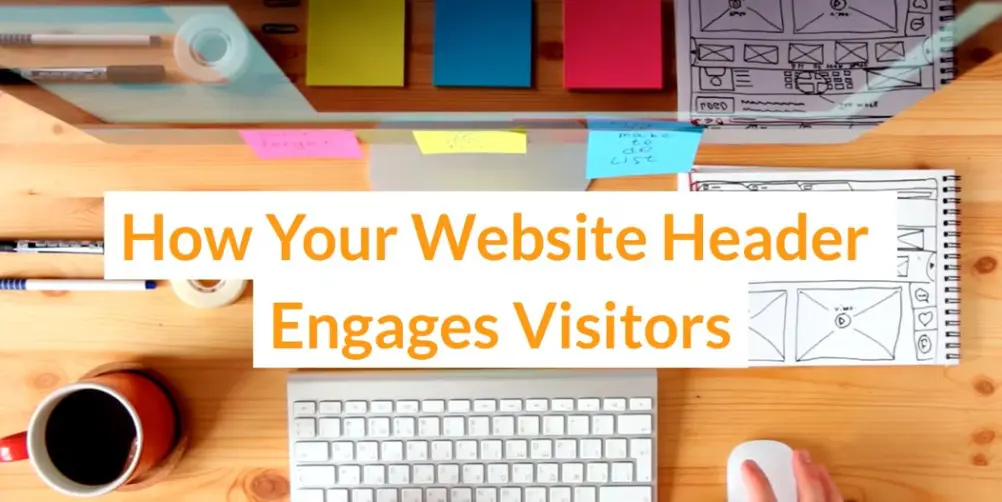
You shouldn’t judge a book by its cover, but you can judge a website by its header. The header is the first thing visitors see, and as with any first impression, it matters.
Think of it like the table of contents in a book—it helps visitors quickly find what they’re looking for. Just like you start reading a book from the first page, when navigating a website, you start at the top and work your way down. That’s why your header needs to include all the key information and navigation links your visitors might need right from the start. It should also include a glimpse into your brand and what sets you apart.
Headers are essential to the usability of your website. They make navigation easier, showcase your brand, and boost engagement with calls to action.
(rawpixel.com/Freepik)
What is a Website Header?
Your website header is the section or banner at the top of the website that contains the brand logo and search bar, navigation links, options to sign up or log in, and specific calls to action for interested customers. It gives a brief overview of your brand and what you’re all about. A strong designer will keep readers interested and on your webpage. Chaotic design can frustrate users, resulting in higher bounce rates and fewer sales.
What Type of Website Header Should I Use?
When it comes to your header, you need to make the most of your space—strategically including all the relevant information for your website. Depending on your website’s unique needs, products, services, and target audience, this could look different.
Because of this, the type of header you choose will vary depending on your website’s goals. A simple site might just need a logo and key details, while an eCommerce site would likely require a search bar, sign-up button, logo, and more. There are eight main header types that we will explore below.
1. One-Line Header with Logo Aligned to the Left
This layout type places the logo in the upper left hand of the page, with the buttons and navigation links extending to the right. This format is popular with news websites because it is professional-looking and easy to navigate.
2. Mobile-Optimized Header with Hamburger Menu
This header is user-friendly on smaller screens. The hamburger menu is an icon with three horizontal lines that, when clicked, reveal the site’s main navigation links. This design helps save space and keeps the website user-friendly and easy to navigate on mobile devices.
3. Hybrid Desktop/Mobile Header
A hybrid desktop/mobile header adapts to different screen sizes—an excellent option for people wanting to easily switch between desktop and mobile options. Instead of having separate designs for each, this approach adjusts the header elements based on the screen’s width.
4. Mega Menu Header
This header is ideal for websites with many options or a lot of content. When you hover or click on a main menu item, it displays a large, organized dropdown menu with multiple links at once. This helps visitors quickly find what they’re looking for without overwhelming them with too many choices.
5. Header with Notification Bar
This heading displays important messages, updates, or promotions at the top of a website. The notification bar can stay visible even when users scroll down, helping visitors quickly notice important information, like a sale or a new announcement.
6. Header with Utility Bar
This header adds extra features above the main menu at the top of the page. It’s usually a small bar where you can put things like contact info or social media links. This keeps important details easy to find without distracting users from the website’s main design.
7. Transparent Header
This header blends in with the background, allowing the content behind it to show through. It’s a more modern option that uses eye-catching photos and videos, giving the site a more artistic feel. Designers use this header type on creative websites or portfolios, where the visuals are just as important as the navigation in standing out.
8. Header with Multi-Site Navigation
This header type is helpful for businesses that manage several different websites or platforms under one roof. It allows visitors to easily switch between related sites without searching for them. This type of header keeps everything connected and makes for a smoother user experience across different sections of the brand.
Tips for Designing a Strong Header
- Embrace Visual Hierarchy—Organize items in order of importance in a way that looks good and makes sense. Calls to action should be easy for the user to follow.
- Use Vertical Design—Vertical header menus are a convenient option, as they allow you to add considerably more links without filling the header.
- Keep it Simple—A clean and easy layout helps visitors find what they need without getting overwhelmed. Avoid adding too many links, buttons, or images that could distract or confuse people.
- Design With Your Audience in Mind—Use design features that appeal to your target audience. Imagine you own a hiking goods store in Ogden, Utah. If part of your brand identity is a commitment to the environment or the outdoors, use colors, videos, and images that appeal to your ideal audience.
- Stick to Your Brand Identity—Your logo should stand out clearly in the header, and the style, fonts, colors, and tone should all work together consistently. This creates a cohesive look that makes your brand feel trustworthy and professional.
Conclusion
The most effective websites have a compelling website header. Start by defining your business goals and choose the best header option to support those goals. Visitors to your website should quickly feel right at home and be able to navigate quickly to find the information they need. This helps you turn website visitors into paying customers.
Use these tips to create a web experience your users will want to interact with. If you are looking for design professionals who can create a website header that is perfect for your unique business, contact our custom web design agency serving Salt Lake City, Orem, Ogden, Layton, Provo, and surrounding areas.
Video
Infographic
Website headers play a vital role in branding, enhancing user experience, and ensuring functionality. An effective header simplifies navigation, maintains a clean design, and boosts engagement. Explore the various types of headers in this infographic.
